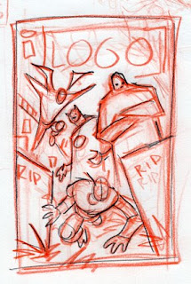
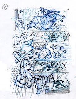
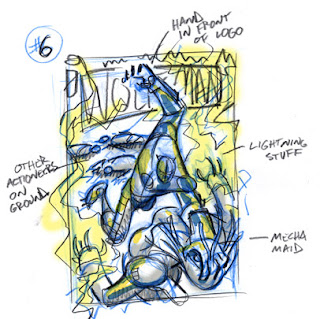
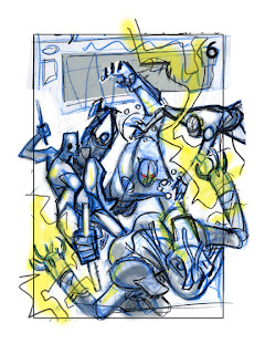
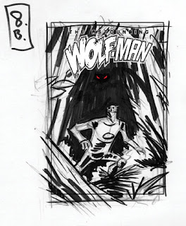
Now to totally contradict what I said above about trying not to doing multiple layouts and extensive pre-drawing. The idea for this cover came from a conversation with the writer. My first sketch came very quick and I kinda liked it so I dropped in some color to help me think about the design a little. I wanted some good contrast and energy so I went with a complimentary color scheme (2 colors opposite each other on the color wheel for you non-art school kids).
 After discussing this with Robert, we felt that it might work better to show more of Wolf-Man and a little more background.
 I didn't like that one much as it is DULL and BORING. I tried to keep the same idea but punch it up a bit with this version.
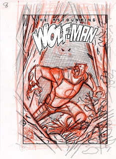 I felt this one was working but the figure behind Wolf-Man was getting lost. Just showing 2 little eyes did not seem like it would be enough to suggest a menacing figure behind poor Wolf-Man. Also Wolf-Man looked a little too freaked out. He is supposed to be cool you know. I tried to address these with the next layout.
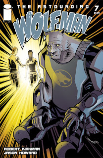
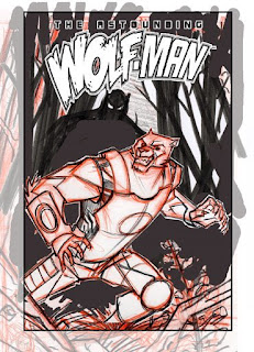 I felt this one was almost there. As you can see I dropped the logo in on the sketch to see how everything fits together. I didn't like the way that the elements fit in with the arc on the bottom of the logo. Flipping the image worked better, I also redrew Wolf-Mans pose and expression to look less angry and a little more startled.
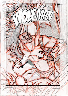
With the design and most of the drawing figured out I dropped some color into the layout in order to get a feel for how the final design would work. I tried to stay with the complimentary scheme from my very first idea, but I pushed to green a bit to teal/blue side to get away from the Christmas colors that most people think of when they see red and green used together.
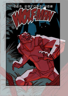
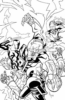
I then enlarged my layout, and lightboxed it onto the final board where I inked it.
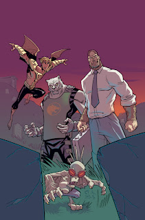
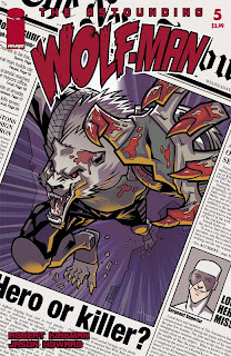
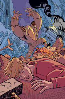
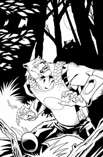 And then the final colors in which I lost the red in favor of a simpler more subdued color scheme (analogous ?). This allowed me to be a little more representational with Wolf-Mans costume colors and create nice night time mood. I added some trees in the background at this stage, I felt they really helped add some depth.
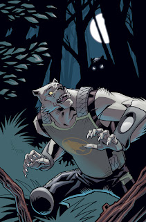
So there it is. A long post this time, and a little bit of the crazyness that can go into a cover. By the way, this issue should be out sometime soon, it has been done for a little while. Once I know the exact date I will post it here.


