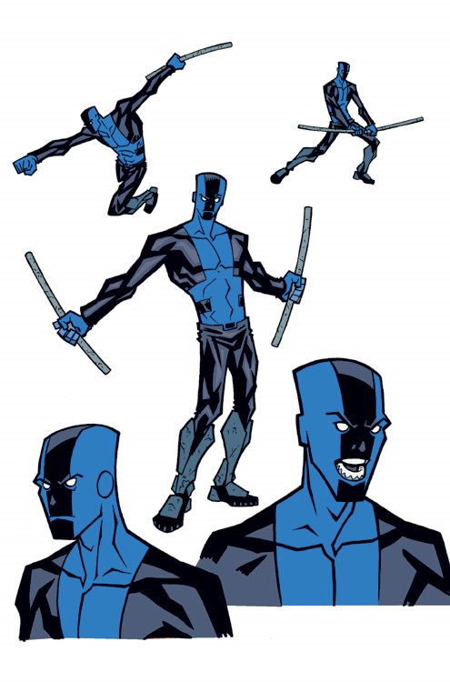
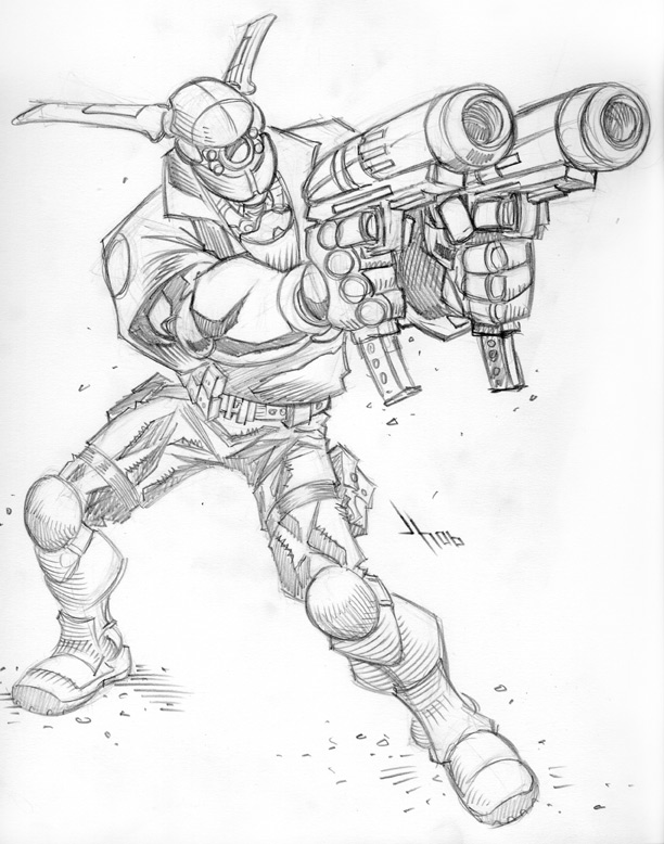
After looking at it more we decided that it might be better to have the other characters in the foreground.
 As is my usual process, I enlarged the layout to comic board size and lightboxed it with blue pencil, tightening details and tweaking things a bit as I drew. And I forgot to scan my pencils again, so you can't see those. See the problem is that I don't have a big scanner, so I have to scan this stuff in pieces and put back together in Photoshop. I hate that part, cause nothing ever lines up right. So beacuse I don't like doing it and because I don't need to do it for the pencils (other than to show you guys) I often "forget" to do it. But I'll try to do better. Promise. Anyway, excuses over, here are the inks. Yay!
 And now the final colors.


 Also, I should have a cover process post for issue #6 coming soon. Tell your friends.
 sdfdsf
 ...but Robert wasn't down with Wolfman's pose. So I worked up some other ideas. We decided to go with number "B" below.
 Here I tightened up the drawing a bit. I really wanted the logo and everything to fit together well. So I mocked it up in Photoshop with the logo to make sure I had enough room.
 Then I enlarged this to fit standard comic board size and lightboxed it to the board with blue pencil, tightening up the details as I traced it. I dont have a scan of those, so you will have to use your imagination and picture it. While your at it also imagine a beach in the Carribean on a beautiful sunny day. Your laying there next to a gorgeous woman (or man) with no responsibilities just enjoying the moment. Nice isnt it? Well hopefully this final image of the inked and colored cover will bring you a small portion of that Carribean happiness. Or maybe it won't but its all I have for you.
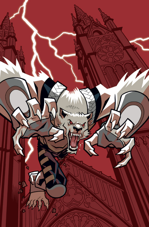
 I wanted Wolf-Mans hand to really pop out and as I messed with the design more it seemed to better use the space and tuck under the logo to flip the image. I liked the left to right movement of the sketch, but I just couldn't make it work. So I changed it. Thats the best part of being an artist, I do what I want and justify it as a "creative" decision :) These are the pencils.


 Once I am happy with the pencil drawing I ink the image. Nowdays I use PITT brush markers and some pens, these are so much faster for me than a "real" brush. In this stage the design changed a bit as we decided to leave out the cast shadow.
  I scan the finished ink drawing into Photoshop, where I color it. Although in this case there is not much actual color :) I like to try to design a cover to "pop", that is why I decided to color most of it in gray tones excpt for the blood.
 That is pretty much my process for most pages, although I am always trying new things in hopes I may find a faster/better method. Also dependng on how comfortable I am with whatever I am drawing, sometimes my pencils are much looser than above.