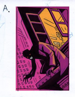
After talking about the type of image that we wanted with Robert, I did a couple small sketches. I wanted something with a "Batman" feel. This one seemed to have potential so I dropped in some color to start getting a sense for what the final image might look like.
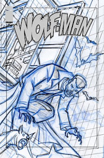
 Once I got the OK on this sketch I began the pencils. After seeing how it worked with the logo dropped in place, I decided that the design worked better facing the other direction.
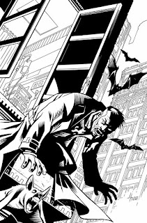
Then on to the inks. This was done with a real brush. This marks a switch for me on Wolf-Man as previous to this I had mostly been using brush markers and pens to ink with. Since this cover I have done a majority of the inking with a real brush.

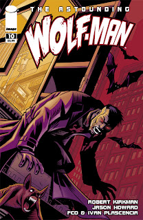
And here is the final cover all colored and with the logo and other trade dress in place. So as not to make it seem too "girly" I left out the pink background in favor of the red. Sorry to any girls who would have preferred the pink :)


4 comments:
very nice!!!!:) KUDOS!
Great image!
Your grasp of color never ceases to amaze.
The transition to a real brush was a good choice as this work shows. The Final inks are truly astounding!
Keep it up,
-Jacot
Great stuff Jason!!
Keep these "behind the scenes" coming, they're always great to see.
I like that you left a little bit of pink on the jacket and the bats, it makes the scene more vibrant and interesting.
Post a Comment