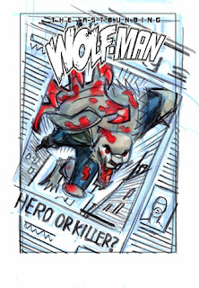
Here goes! Initally we tried some other design ideas for this cover but they were bad. In trying to come up with something cooler Robert suggested the newspaper approach, I instantly I had an idea for the image and this was my early sketch.
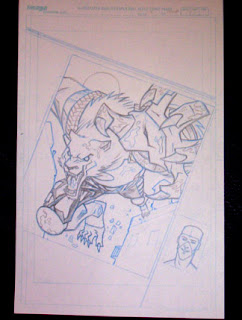
I wanted Wolf-Mans hand to really pop out and as I messed with the design more it seemed to better use the space and tuck under the logo to flip the image. I liked the left to right movement of the sketch, but I just couldn't make it work. So I changed it. Thats the best part of being an artist, I do what I want and justify it as a "creative" decision :) These are the pencils.
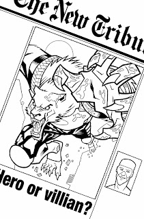
Here are the inks. Pretty much a trace job, because my pencils were so tight. I really need to loosen up with the penciling. Sometimes I do better than others, but for some reason I got pretty tight with these. Although for me there is always a little more pressure with a cover to get the lines just right, that tends to result in my tightening up. I added the text on the computer (thank you Adobe Illustrator) and for some dumb reason I changed "killer" to "villian". I also spelled it wrong. Killer sounds cooler (and is eaiser to spell) so I changed it back on the final, don't know what I was thinking here.
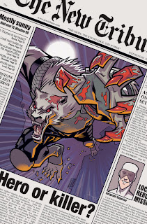
And finally the colors with all the newspaper text added. Robert wrote most of it. There is some funny stuff in there. Also some nice story bits.

 ...but Robert wasn't down with Wolfman's pose. So I worked up some other ideas. We decided to go with number "B" below.
 Here I tightened up the drawing a bit. I really wanted the logo and everything to fit together well. So I mocked it up in Photoshop with the logo to make sure I had enough room.
 Then I enlarged this to fit standard comic board size and lightboxed it to the board with blue pencil, tightening up the details as I traced it. I dont have a scan of those, so you will have to use your imagination and picture it. While your at it also imagine a beach in the Carribean on a beautiful sunny day. Your laying there next to a gorgeous woman (or man) with no responsibilities just enjoying the moment. Nice isnt it? Well hopefully this final image of the inked and colored cover will bring you a small portion of that Carribean happiness. Or maybe it won't but its all I have for you.


