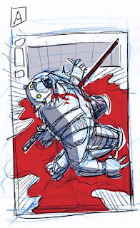
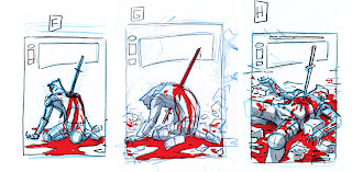
Howdy. Cover process time! This cover for me was all about getting the right design. Robert discussed with me what would be happening and his idea for a cover for this issue. Based on this I did sketch A. This sketch came right away and I really liked it and thought it would make a cool 'in your face' cover. But Robert wanted to see something different. So I worked up some other sketches which i didn't like so much. I just couldn't get into them, mainly because I felt I had already solved the design with version A. After discussing these with Robert and letting a little time pass, I came back and did sketches F- H. We agreed on G, and I banged it out. I literally spent more time on the sketches for this cover than I did on the actual drawing of the cover.
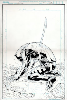
As usual I forgot to scan my finished pencils.But the process went like this. I enlarged my sketch to about 4" X 6", tightened up the drawing on another sheet of paper, then I scanned that enlarged it to full comic page size, converted it to light blue color and printed to directly to the comic board. The I added detail and fixed things up a bit in pencil. I inked over that mainly using a brush on the figure and pens on the sword and ground.
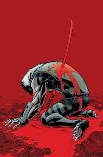
After it was inked, I scaned it and using my good friend Photoshop added some color. I love coloring the covers, particularly as I now am no longer coloring the interior pages to the book. My goal is to pick a color scheme that I feel will pop, and make the image stand out.
And that is all.


 As usual I forgot to scan my finished pencils.But the process went like this. I enlarged my sketch to about 4" X 6", tightened up the drawing on another sheet of paper, then I scanned that enlarged it to full comic page size, converted it to light blue color and printed to directly to the comic board. The I added detail and fixed things up a bit in pencil. I inked over that mainly using a brush on the figure and pens on the sword and ground.
 After it was inked, I scaned it and using my good friend Photoshop added some color. I love coloring the covers, particularly as I now am no longer coloring the interior pages to the book. My goal is to pick a color scheme that I feel will pop, and make the image stand out.
 And that is all.
6 comments:
AWESOME dude!!!
your work process seems to be, for me, a little complicated to do with the interior pages.
But you do the inside pages of the book this way, right?
Cover A definately looks the most iconic and is my favorite, it's grand and epic... however, the final cover does fit with the narrative more, if it was his daughter who stabbed him.
He looks more like he's been let down and had his heart broken by someone very close to him, as apose to just being turned into a wolf kabab.
"The Melancholy Wolf-Man" is a far more fitting title looking back over the covers.
Great stuff as usual Jason, very interesting and informative. Love the final cover, it's definitely one that will "pop" on the shelves.
"A" is my favorite as well but if it is not conveying the true story or direction I understand going with a different one...
thanks for the process posting, it is a highlight for many of us
Really kind of astounding how beautiful pain can look in the right light.
Where can I get the cover A variant? :)
The amount of pain you guys are going to continue putting Gary through looks to be fascinating.
One day Daredevil is going to walk into a bar and start talking about all his problems and Gary is going to turn around, look at him in the eye with an incredibly pissed off expression and say "Do you want to hear what MY day was like?!"
Definitivamente un trabajo extraordinario en las portadas, y por supesto una gran historia, aunque por aca aun no llega The Wolfman 9 lo esperamos con ansias.
Un gran saludos desde Mexico Jason y espero que sigas por muchisimo tiempo con esta gran historia!!
un Fan mas!!
you're right in saying that this cover really stands out, which is very much a good thing. Great cover with great colors.
Post a Comment