It has been a while since I have gotten around to one of these cover process posts. I am kind of a process guy, I tend to feel that my work generally gets better the more opportunities I have to refine it. This has created a fun challenge for me as lately I have been trying to be more spontaneous in drawing pages and not spend so much time on layouts and other drawings that don't actually end up being the final drawing. How do I get everything necessary into the final page while still at or above what I feel is good quality work? I am not sure yet, but the one thing I like about just drawing a page without doing much in the way of pre-drawing the page is that it is more fun. When I drew stuff as a little kid, I never did thumbnails, I never drew a rough layout there were no lightboxes or computers, I just drew what I envisioned right on the paper. When I finished it was done and I moved on. Some where along the way I got concerned about composition, design, anatomy (sort of), perspective and all the other things that go into a "good" drawing. The idea of start to finish drawing the finished drawing on the same piece of paper became lost to me. So for now I am working to recapture some of that lost art. I do miss some of the opportunities to edit the drawing that other working methods provide, but I am hoping that taking this direction will force me to make better choices and learn some things along the way.
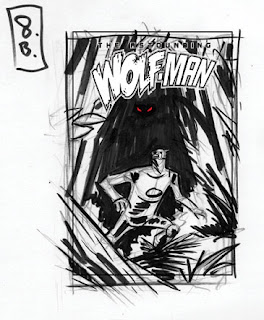
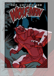
Now to totally contradict what I said above about trying not to doing multiple layouts and extensive pre-drawing. The idea for this cover came from a conversation with the writer. My first sketch came very quick and I kinda liked it so I dropped in some color to help me think about the design a little. I wanted some good contrast and energy so I went with a complimentary color scheme (2 colors opposite each other on the color wheel for you non-art school kids).

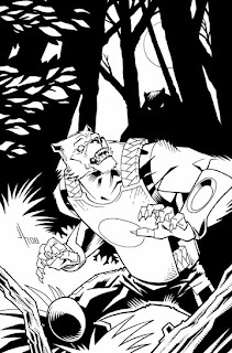
After discussing this with Robert, we felt that it might work better to show more of Wolf-Man and a little more background.
I didn't like that one much as it is DULL and BORING. I tried to keep the same idea but punch it up a bit with this version.
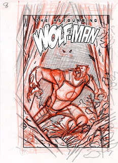
I felt this one was working but the figure behind Wolf-Man was getting lost. Just showing 2 little eyes did not seem like it would be enough to suggest a menacing figure behind poor Wolf-Man. Also Wolf-Man looked a little too freaked out. He is supposed to be cool you know. I tried to address these with the next layout.
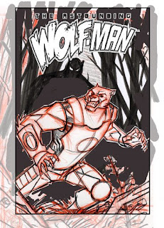
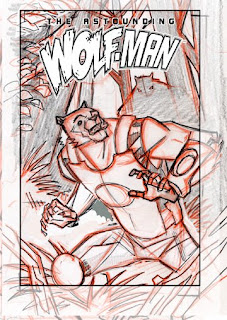
I felt this one was almost there. As you can see I dropped the logo in on the sketch to see how everything fits together. I didn't like the way that the elements fit in with the arc on the bottom of the logo. Flipping the image worked better, I also redrew Wolf-Mans pose and expression to look less angry and a little more startled.
With the design and most of the drawing figured out I dropped some color into the layout in order to get a feel for how the final design would work. I tried to stay with the complimentary scheme from my very first idea, but I pushed to green a bit to teal/blue side to get away from the Christmas colors that most people think of when they see red and green used together.
I then enlarged my layout, and lightboxed it onto the final board where I inked it.
And then the final colors in which I lost the red in favor of a simpler more subdued color scheme (analogous ?). This allowed me to be a little more representational with Wolf-Mans costume colors and create nice night time mood. I added some trees in the background at this stage, I felt they really helped add some depth.
So there it is. A long post this time, and a little bit of the crazyness that can go into a cover. By the way, this issue should be out sometime soon, it has been done for a little while. Once I know the exact date I will post it here.

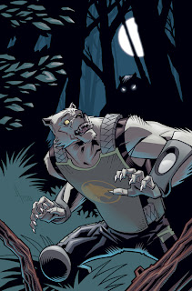
 Now, I dont want your trip here to be lacking any new art to see, so here is the cover I just finished for the second trade paperback. I still have the background collage to drop in but I am waiting until I have a couple more issues drawn to do create that. As you can see we are following a consistent design approach with these covers, once we have a few out they should look pretty sweet all together.


